www.twitter.com/alisonpascoe

Sunday 31 July 2011

Grief

This image is inspired by a poem I once wrote with the line:

"Do not squeeze me; I'll spill all over you".

When I wrote these words, I was thinking about "grief" and how the human body is like a giant container(noun) of emotion. Often when I write poems, the words and ideas are based on visuals that come to my mind. However, it can happen the other way around where descriptive writing helps me fuel imagery. This is how I came by this idea for an illustration depicting "grief" which I defined as "an overflowing sea of sadness".
Grief


I hope the image strongly reflects an emotion that we have all felt at some point in our lives and that people identify with the image.


As always, thanks for stopping by.

Alison.


Wednesday 13 July 2011

It's Showtime!


Hi,
I got back from Dominican Republic last Monday after spending two amazing and insightful weeks there with my family to finish this poster commissioned by employees of Iceland, Penzance. The charity event is in aid of Alzheimers Research UK.
At the event, there will be karaoke, a buffet and a charity auction. Pete Caradine will be performing a tribute to Neil Diamond as well as music from the 60s and 90s. As you can tell, it's a pretty eclectic event so I had to be careful to avoid those generic musical cliches such as microphones, stars, musical notes etc...

Karaoke/Pete <span class=


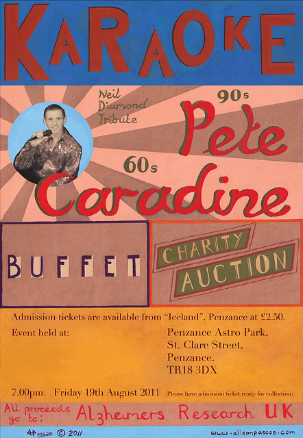
My idea was to create a poster made up of different typography. I had some lovely brown paper and used this as a background on which to paint on. I had to include a photo of Pete Caradine from a promo that was sent to me. The photo was amateur and therefore not the best quality. It was very dark so I changed the brightness/contrast and hue/saturation until it was clearer and fitted into the poster's asethetic better. I cut around it roughly in photoshop and pasted it on digitally. This added a scrap-book quality to the image and luckily the standard of the photograph has accentuated this.

I had a go at hand-rendering all of the logistical info by hand but wasn't happy with this and decided to use a digital font for this aspect of the poster. I don't think it has detracted from the poster's overall aesthetic.

Initially I was informed the entertainer was called Paul, instead of real name, Pete. This resulting in me having to paint "ete" of Pete and layer it over the "aul" in Photoshop, adjusting it's size and hue/saturation until it blended seamlessly. This of course was not a great problem because Photoshop is fantastic. But it gave me an appreciation of illustrators 30 years ago who no doubt would have had to repaint a section of the poster and neatly collage over it as best as they could. I am thankful I was born now and not then!

So what do I think of it overall?

It is eye-catching which is important. I like some panels better than others. The "Buffet" panel is stylish and striking. I am not so keen on the type I rendered for "All proceeds go to: Alzheimers Research UK" but the main thing is all aspects of the poster are legible and the good bits balance out the mediocre bits to result in an image that I am pretty pleased with. I also designed some admission tickets and another simple poster all of which the client was very pleased with- phew!

By the way, whether you are a regular reader or passer-by, please remember to follow! (Finally worked out how to add a Follow button). It would be nice to get to know who my readers are and in turn view/follow your blogs.


As always, thanks for reading and check in soon.


Alison.

Thursday 5 May 2011

Wilfred and the Swallowed Ocean

Hi Everyone,

It's been very quiet on my blog recently. This is mainly because I have a job as a Photo Retoucher for a photographic studio near to where I live. As it is seasonal, I do 10-12 hours a day in order to "hoard money" for when, in 5 weeks time, I will be an impoverished freelancer again!

But in the meantime I have lots of ideas brewing and spilling out onto sketchbooks so I plan to bombard you with creativeness very soon.


However I thought I'd leave you with something...

Below is an illustration for a self-written book called Wilfred and Swallowed Ocean. I originally produced it in Year 2 of my Illustration degree. I was experimenting with media and hadn't found my style. The image is very detailed anyway and therefore the use of collage makes it look cluttered and some areas of it are hard to make out.

(Please note: This image appears much darker here than when printed out).

Original


I thought the composition and concept was good so I decided to reproduce it in gouache paint. I think the image is much clearer and stronger now. I also think the revised shape of the whale better accommodates the double-page layout it occupies within the book.

Enjoy!


Revised Version


(Please click on the images to enlarge them).


Thanks for stopping by.


Alison.


Thursday 27 January 2011

"The Notting Hill Carnival" Poster

This is a poster for "The Notting Hill Carnival" in London. The carnival has taken place on every August Bank Holday since 1966 and it is the biggest carnival in Europe. The carnival started out as a local festival in the Notting Hill area, set up by the West Indian community. It has now become a "full-blooded Caribbean carnival", attracting millions of visitors from all over the world.

To create the poster, I used clay, greyboard, feathers, coloured paper and gouache. A while ago, I created the eye as a random piece of art. I quite liked it and wanted it to be part of a "bigger picture" which is when I decided to do a poster for the carnival, which this "panel" could be part of. I set about designing different "panels" which would fit together to make the overall poster. I wanted the poster to have a handmade quality which encompassed the feel of the carnival where the majority of the costumes are handmade 3-4 months before the carnival. It was important that the poster also reflected the fun "party" atmosphere and the vibrancy of the Carribean culture.

I have been working on this piece, on and off for a while now, hence the "panel" with the 2010 date which I created before the 2011 date was proposed. Overall I am quite pleased with this work. I enjoyed making the different "panels" of the poster. If I were to change anything, it would be the typography at the bottom of the poster. I would use the same type that I used for the title and I would keep all the type used in the poster the same. However, I think the various fonts emphasise the poster's eclectic appearance.
(Click on image for larger view)


Thanks for visiting!

Please check back soon for more work.

Alison.


"About Me", illustrators I admire and samples of my work.

Below are some samples of my illustration work.

My work can be described as bright, bold, colourful, decorative, creative, playful, inventive, and sometimes conceptual depending on the context of the image.
I predominantly produce images in gouache and occasionally collage elements in. I produce work in both 2-D and 3-D form and sometimes a combination of both depending on time constraints and what would be most effective for the brief. (Also, if the client specifies a preference for one form over the other). Regardless of whether my work is produced in 2-D or 3-D, the bright colours used, the inclusion of pattern and geometric shapes, create a recognisable style.

I am both inspired and humbled by illustrators and artists such as Shawn Tan and Eric Puybaret for their beautiful use of colour. Richard Hamilton, Eduardo Recife, Michelle Thompson and Natsko Seki for their creative use of collage and striking compositions.Muriel Kerba, Beatrice Alemagna, Marc Daniau and Sara Fanelli for their creative characterisation and vibrant picture books. Oliver Thielbaut, Bill Carman, Janell Genovese, Takashi Murakami, Sandrine- Estrade Boulet, Joseph Cornell, Anselm Kiefer and Robert Rauschenberg for their 3-D illustrations/installations. Artists,Wassily Kandinsky, Gustav Klimt and illustrators, Pat Hutchins, Carolyn Gavin and Helen Dardik for their use of pattern and shape. Conceptually, Fritz Kahn, Paul Blow, Brian Stauffer, Jeff Koons, Tracy Emin, Barbara Kruger, Olivero Toscani, Simon Starling and Cristo inspire me. I love the alternative way they view things and the way they make me consider things from a different perspective after witnessing their work.

I am also inspired by are colour trends and combinations used in fashion, wallpaper patterns, ceramics and pottery, mosaics, stained-glass windows, toys from my childhood, mechanical and wind-up toys/automata, diagrams, patterns on graph paper, mathematical charts, instructions. Colour combinations in nature are a great inspiration. God is the ultimate colour theorist. Also colours and pattern used in other cultures.
This list is comprehensive but not exhaustive!!

My favourite children's books are:


"Bugs in a blanket" by Beatrice Alemagna

"My Friend" by Beatrice Alemagna
"big wolf and little wolf" by Nadine Brun-Cosme and illustrated by Oliver Tallec.

I think I like them because they are beautifully illustrated but also the story carries a good message and the book is well paced. I could read them over and over again. I also love anything by Shawn Tan and Oliver Jeffers.


When I am not illustrating, I love going to see films, theatre, reading generally, more specifically reading excellent poetry anthologies, reading how to write good poetry and then proceeding to write mediocre poetry. But I keep trying... Oh, also I love collecting "new" words mentally to use in casual conversation and essays lol. Kind of obsessed with it. I also like doing the typical 22 year old things like hanging out with friends, clothes shopping, occasional clubbing, more frequent "pubbing" and going on holiday. Doesn't everyone?!

I hope you like my work, more work can be found at: http://www.alisonpascoe.com
I am available for commissions, no job is too big or too small. I am also available to work full-time or part-time in-house, either in Cornwall or London. Please contact me if you are interested in working with me or if I am suitable for your company. Contact details can be found at the right of my blog or in the "Contact Me" section of my website.


Right that's it, I am going to stop typing and remove myself from the computer!

Thanks for visiting and have a lovely day!


"Sex on the brain"


"Pressing" Adult Fiction
A fictional story about a romance at a launderette with African references.


A poster for "Edun Live"


Image for an editorial about long- distance relationships.

Thursday 9 September 2010

Hi everyone


Hi Everyone,

Thanks for visiting my blog.

I am surprised at myself for setting up a blog. I tried to keep a diary numerous times in my life, starting from the age of about six. I was terrible at it. I did about 3-4 entries and then stopped. Then I started again a year later, then stopped. So I hope to do better this time around at the grand old age of 22.

T
here are five reasons why I am starting a blog:

1). To keep peo
ple updated on my illustration work. I find updating my website a little tricky to say the least so I will only update it when I accumulate enough work. Please check out my blog in the meantime.

2). Having a blog keeps me motivated to produce new work, knowing it's getting seen regularly.

3). It is good for getting feedback on work before it goes on my site.

4). Keeping a blog will help to document my progress (hopefully!)

5). Plus it is a fun thing to do...


So yes that is why I'm here.

Right now for the work...